Creating buttons
There are two ways of setting up buttons
Using presets
The fastest way to define buttons is to use the presets.
Presets are ready made buttons with text, actions and feedback so you don't need to spend time making everything from scratch. They can be drag and dropped onto your button layout.
Not every module provides presets, and you are able to do a lot more by defining the actions on the buttons yourself, but presets can be a good starting point for those buttons.
Once you have placed a preset, it is editable just like a manually defined button.
These can be found in the Presets tab on the right side of the button grid.
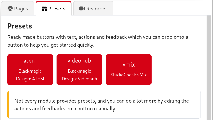
If one of your modules supports presets, it will be listed in this tab for you to select, just like below.
An example of modules currently loaded with premade presets
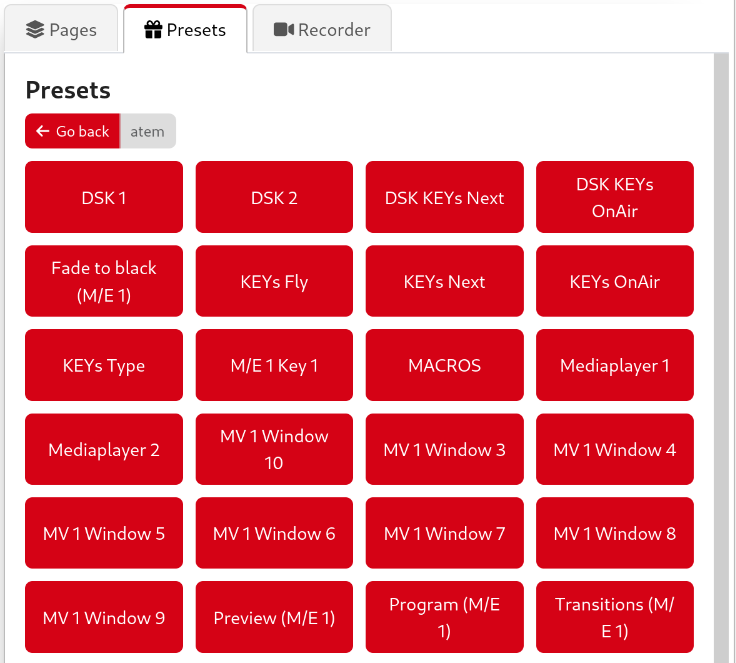
An example of categories of presets you might meet in a single module
Here is an example of presets made for an ATEM ME1 program
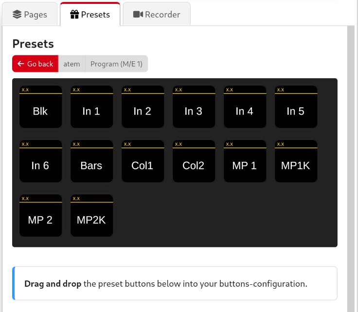
Drag the preset buttons onto a page's button when in the Button Layout view. Keep in mind you may still need to configure the preset after adding it to a button.
You can't add new presets as a user, they are all pre-made by the module developer.
If you think additional presets may be helpful, you can request them on the module's GitHub Issues page.
Manually defining
- Click on the button space you want the button to be located on.
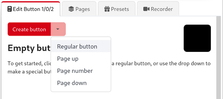
- Set the button's type:
- Regular button: Can trigger one or more actions. You can also click Create button instead of the dropdown to do this
- Page up: Can move up to the next page set of buttons.
- Page number: Shows the current page number/name.
- Pressing this button will return to the home page of the surface (by default page 1).
- Page down: Can move down to the previous page set of buttons.
Button styling
There are several ways you can make your button stand out, including:
- Defining the button text.
- Adjusting the font's size.
- Adding a PNG image (72x58px or 72x72px) to be used as a button's background. Text can be added on top.
- Setting the alignment of the text.
- Setting the alignment of the PNG image.
- Changing the text's color.
- Changing the button's background color.
- Change whether the topbar is shown on the button. This can be changed per button, or globally in the settings.
There are also some behaviour options:
- Change whether to use auto progression when multiple steps are defined Steps.
- Enable rotary actions for this button, to support the dials on a Stream Deck + (or similar).
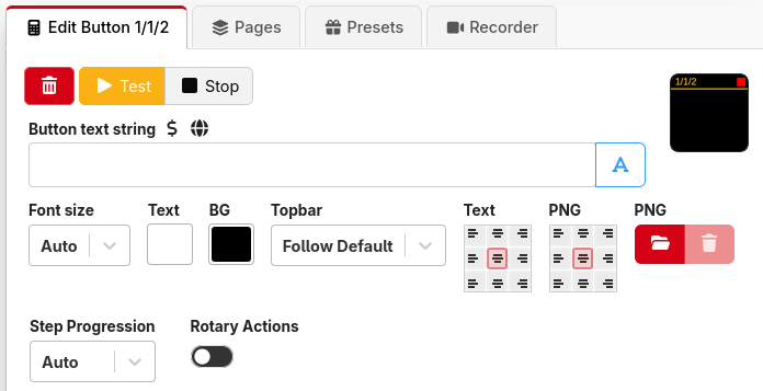
Creating a button
Enter your button's text in the Button text field, then select the alignment and font size. Text and background colors can also be changed.
You can force a newline in a label by typing \n where you want the newline to appear.
You can write the text either as a string optionally using variables, or it can be written using the expression syntax. Clicking the button to the right of the text field will change the mode.
A live preview of the button will be shown on the top right corner. Button information will update in real-time in the Emulator and on any connected Surfaces.
Add actions to the button from the Add Press/on action drop-down menu.
You can add multiple actions and use the internal: Wait Action to delay when certain things happen. Delay times are in milliseconds. 1000ms = 1 second.
You can hide the topbar with the dropdown. This can be configured globally in the settings, or overridden per button.
Same 72x72px image, but with and without the topbar
Adding a PNG
Make a 72x58px PNG image or use a 72x72px PNG, but it will get cropped to fit 72x58px by the topbar. Unless you disable the bar in the settings tab. See the Settings section below.
Click the red Browse button and choose the PNG file you want to use. The picture will appear on the top right preview of the button. Text can be applied over the image.