Feedbacks
Feedbacks have changed significantly in Companion 5.0. Because buttons are now built from layered graphics elements, boolean feedbacks restyle a button by overriding properties on those elements rather than setting a fixed button style. If you're coming from an earlier version, read How feedbacks restyle a button below.
A feedback lets a button change its own appearance automatically, based on what's happening. It's how a button can turn red when a camera goes live, show a different label when a mixer channel is muted, or light up while a layer is on air — all without you touching anything.
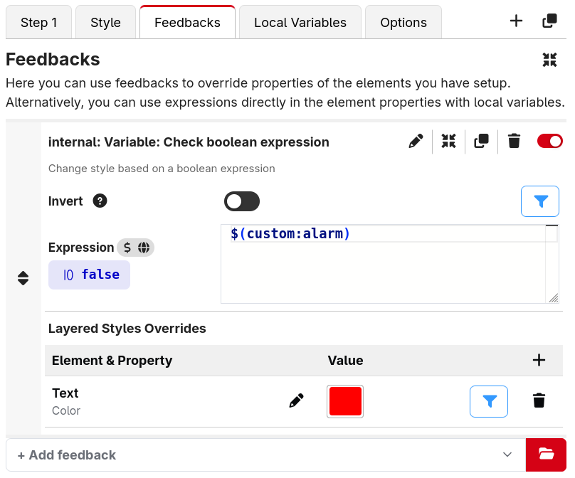
Some feedbacks come from your connections (the module reports the device's state), and Companion also has built-in feedbacks for generic logic, such as "change the style when this variable has a certain value".
You don't always need a feedback
Feedbacks are no longer the only way to make a button react to changes. Every property on a graphics element can be an expression instead of a fixed value. An expression can reference variables and do calculations, and the element automatically redraws whenever any variable it uses changes.
That means a lot of dynamic styling no longer needs a feedback at all. For example, without adding a single feedback you can:
- Set a Text element's content straight from a variable.
- Make a Text element's Color an expression that returns red or green depending on
$(custom:armed). - Show or hide an element with its Enabled field — e.g.
blink(500)to blink.
So when do you still want a feedback? Feedbacks shine when the styling comes from a connection's reported state (module feedbacks), when you want to toggle several overrides on and off together as one on/off rule, or when you simply prefer configuring the change as a rule rather than writing an expression on each property. The two approaches work side by side — use whichever is clearer for the button you're building.
How feedbacks restyle a button
Because buttons in Companion 5.0 are built from layered graphics elements, a feedback works by overriding properties on those elements while its condition is true.
When you add a style override to a feedback, you:
- Click to Add Element Properties and pick which element to affect — for example the Text element, the Image element, or the Background.
- Pick which properties of that element to override — for example a Text element's Color, Text Size or the text itself; or the Background's Color.
- Set the value to apply. While the feedback is active, those properties take over from whatever the element is normally set to.
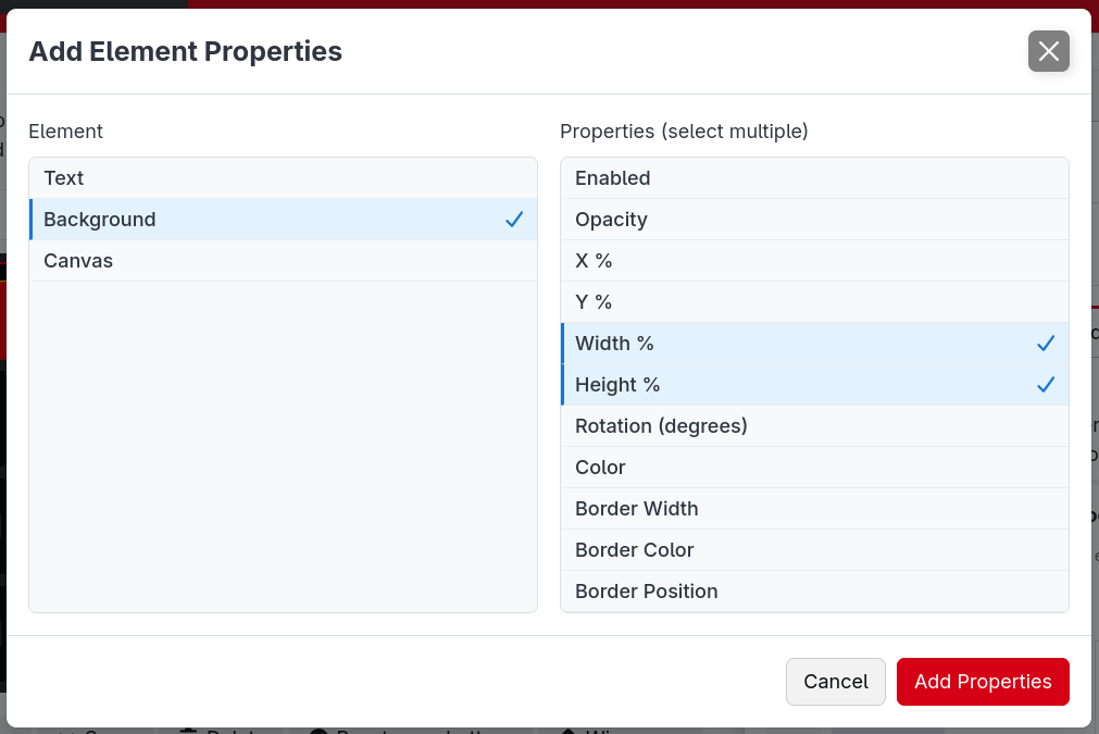
You can add several element/property overrides to a single feedback, and you can reorder feedbacks by dragging the sort handle. They're applied from the top down, so a feedback lower in the list wins if two feedbacks change the same property.
This is the opposite priority to earlier versions: in 4.x a feedback higher in the list took precedence, whereas in 5.0 the lower (later) one wins.
A quick example
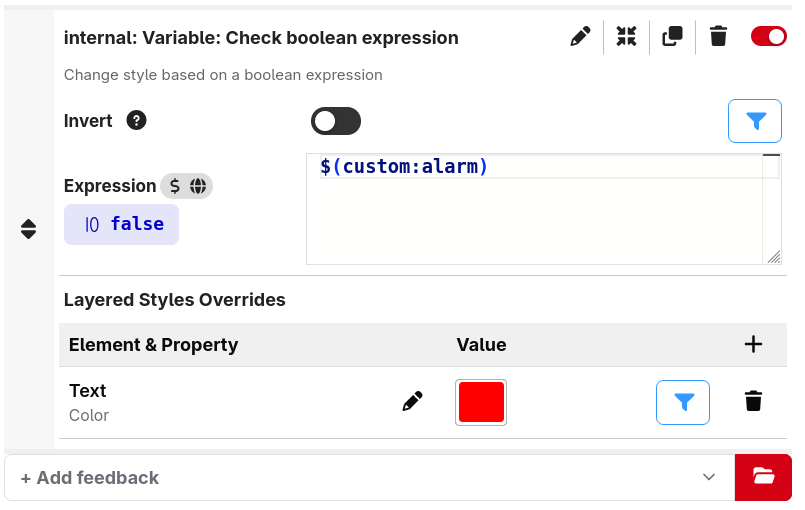
Say you want a button's text to turn red when a custom variable alarm is true:
- Add the built-in feedback that checks an expression, and set the expression to
$(custom:alarm). - On that feedback, Add Element Properties, choose your Text element, and add its Color property.
- Set the color to red.
Now the text is red whenever alarm is true, and returns to its normal color when it isn't.
You used to set a feedback's style on a single flat button style — "make the button's background red". That still works the same way conceptually, but now you're saying it more precisely: "set the Background element's Color to red". The trade-off is that you choose which element a feedback affects, instead of it always applying to the one-and-only button style.
You don't need to redo anything: when you open an existing configuration, Companion automatically converts your old feedbacks to target the standard Text, Image and Background elements, so they keep looking exactly as they did before.
Boolean feedbacks vs. module style feedbacks
- Boolean feedbacks are on/off: when their condition is true, your configured overrides are applied. The expression/variable feedbacks above are a good example.
- Module (advanced) feedbacks are provided by a connection and return a whole style based on the device — for example a meter or a status color. A module declares which properties its feedback affects, and you map those onto the elements on your button.
Some modules also provide feedbacks that draw a complete generated image, typically to show a complex status in a well-arranged way.
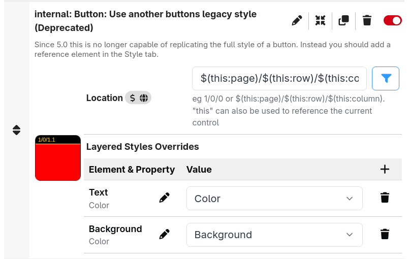
A few older module feedbacks are limited in what they can change. If you find a module's feedbacks too limited for what you're building, open a feature request on that module's GitHub to get them updated.