Button styling
In Companion 5.0 the way buttons are drawn has been completely reworked. Instead of a single fixed style (one block of text, one background image, one set of colors), a button is now built up from a stack of graphics elements — small building blocks like text, images and shapes that you layer on top of each other to create exactly the look you want.
If you've used Companion for years, the short version is: everything you used to set in the button style (text, font size, background image, colors) is still here — it's just been split into separate elements that you can add, remove, reposition and restyle individually. A plain button with some text and a background image is now two elements: an Image element and a Text element. Nothing you could do before has gone away; but you can now do a lot more.
The old background color is now the element named Background near the bottom of the stack. There's no dedicated "background" element type — it's simply a Box element that's been sized to fill the whole button (X 0, Y 0, Width 100, Height 100) with no border. You can restyle it, rename it, or delete it like any other element. If you remove it and later want it back, add a Box element.
How the layered editor works
When you edit a button you'll see two things:
- A live preview of the button in the top corner, which updates as you make changes (and updates on your real surfaces and the Emulator in real time).
- The elements list — the stack of elements that make up the button. Elements at the top of the list are drawn on top of the ones below them, just like layers in an image editor.
At the very bottom of every button's stack is the Canvas layer. This is always present and can't be deleted — it controls the topbar, status icons and the empty-button look. See The canvas & button indicators for more on it.
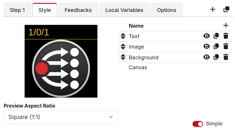
Adding an element
Click Add element and pick a type. The built-in element types are:
| Element | What it's for |
|---|---|
| Text | Show some text — a label, a variable, or the result of an expression |
| Image | Show an image, either uploaded from your computer or from the Image Library |
| Box | A filled rectangle, with an optional border |
| Line | A straight line between two points |
| Circle | A circle or arc, with an optional border |
| Group | A container that holds other elements so you can move and reuse them together |
| Reference | Mirror the graphics of another button (great for reusable designs) |
Some modules also provide their own ready-made composite elements — for example a meter or a status badge tailored to that device. When a connection offers these, they appear in the Add element menu grouped under that connection's name.
This set of built-in elements is just the starting point. We intend to add more building blocks over time as common needs are identified, so expect this list to grow in future releases. If there's an element type you'd find useful, let us know.
Reordering, duplicating and removing
Each row in the elements list has a few controls:
- Drag handle — drag an element up or down to change which layer it sits on. You can also drag an element into or out of a Group.
- Visibility — toggle whether the element is currently shown in the preview render.
- Duplicate — make an exact copy of the element, with all its properties. This is handy when you want two similar bits of text or several evenly-spaced boxes.
- Remove — delete the element.
Element properties
Select an element to edit its properties.
By default the panel is in Simple mode (the toggle sits in the bottom-left of the editor, and your choice is remembered between sessions). Simple mode shows just the handful of properties you change most often — for a Text element, for example, that's the text itself, its size, color and alignment — with a note at the bottom reminding you that some fields are hidden in simple mode. Turn Simple off to reveal the full set of properties.
Simple mode trims the panel for the elements that have a lot of properties (Text, Image and Box); the other element types always show their full set.
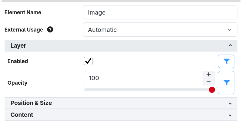
With Simple mode turned off, the properties are grouped into collapsible sections so the panel stays tidy. Every element (except the Canvas) shares two sections:
Layer
- Enabled — whether the element is drawn. This field accepts an expression, so you can show or
hide an element conditionally. For example, set it to
blink(1000)to make the element blink once a second, or$(custom:armed)to only show it while yourarmedcustom variable is true. - Opacity — how solid the element is, from 0 (invisible) to 100 (fully opaque). Lower values let the layers beneath show through.
Position & Size
Elements are positioned using percentages of the button, not fixed pixels. This means your design looks the same whether it's drawn on a small Stream Deck key or a large high-resolution surface.
- X % / Y % — the top-left corner of the element, as a percentage across and down the button.
- Width % / Height % — the size of the element as a percentage of the button.
- Rotation (degrees) — rotate the element around its centre.
For example, an element at X 0, Y 0, Width 100, Height 100 fills the whole button, while
X 50, Y 0, Width 50, Height 100 fills the right-hand half.
The simple shape elements
Box, Line and Circle are straightforward and are useful for backgrounds, dividers, borders and indicator dots.
- Box — a filled rectangle. It has a Fill section (color) and a Border section (width, color, and whether the border is drawn inside, centred on, or outside the edge).
- Line — a straight line. You set the From and To points (each as X %/Y %) and the line's width, color and position.
- Circle — a circle or arc. As well as a fill and border, you can set a Start Angle and End Angle to draw just part of the circle, and tick Draw Slice to fill it as a pie-slice instead of a thin arc.
The richer elements
The remaining element types each have a page of their own:
- Text element — fonts, sizing and alignment
- Image element — uploading images and using the Image Library
- Groups & references — organising and reusing elements
- The canvas & button indicators — the topbar, status icons and empty buttons