Creating buttons
There are two ways of setting up buttons.
Using presets
The fastest way to define buttons is to use the presets.
Presets are ready made buttons with text, actions and feedback so you don't need to spend time making
everything from scratch. They can be drag and dropped onto your button layout.
Not every module provides presets, and you are able to do a lot more by defining the actions on the
buttons yourself, but presets can be a good starting point for those buttons.
Once you have placed a preset, it is editable just like a manually defined button.
These can be found in the Presets tab on the right side of the button grid.
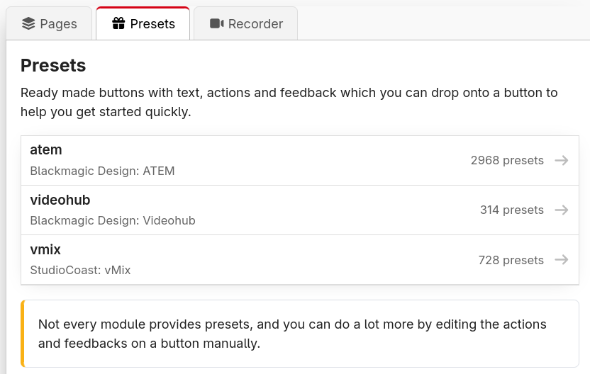
If one of your modules supports presets, it will be listed in this tab for you to select, just like below.
An example of modules currently loaded with premade presets
Here is an example of presets made for an ATEM ME1
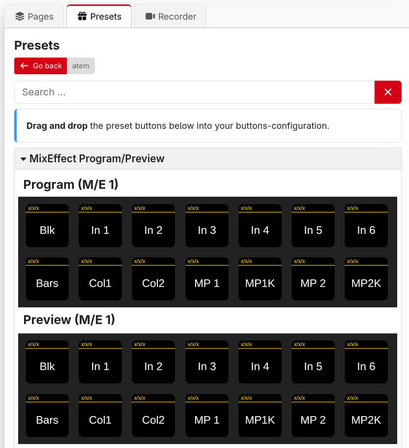
Drag the preset buttons onto a page's button when in the Button Layout view. Keep in mind you may still need to configure the preset after adding it to a button.
Presets are pre-made by the module author, you can't create your own. You can build your own library of presets on other pages, which can be exported and reimported instead.
If you think additional presets may be helpful, you can request them on the module's GitHub Issues page. You can find a link to this in the Connections page
Manually defining
- Click on the button space you want the button to be located on.
- Set the button's type:
- Regular button: Can trigger one or more actions. You can also click Create button instead of the dropdown to do this.
- Page up: Moves the surface up to the next page.
- Page number: Shows the current page number/name. Pressing it returns the surface to its startup page.
- Page down: Moves the surface down to the previous page.
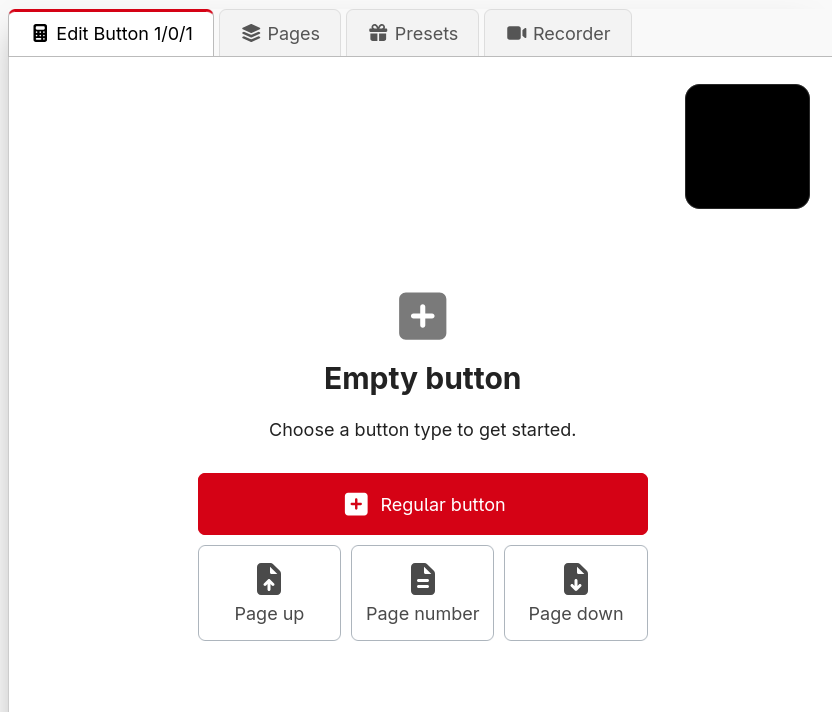
Customising the page buttons
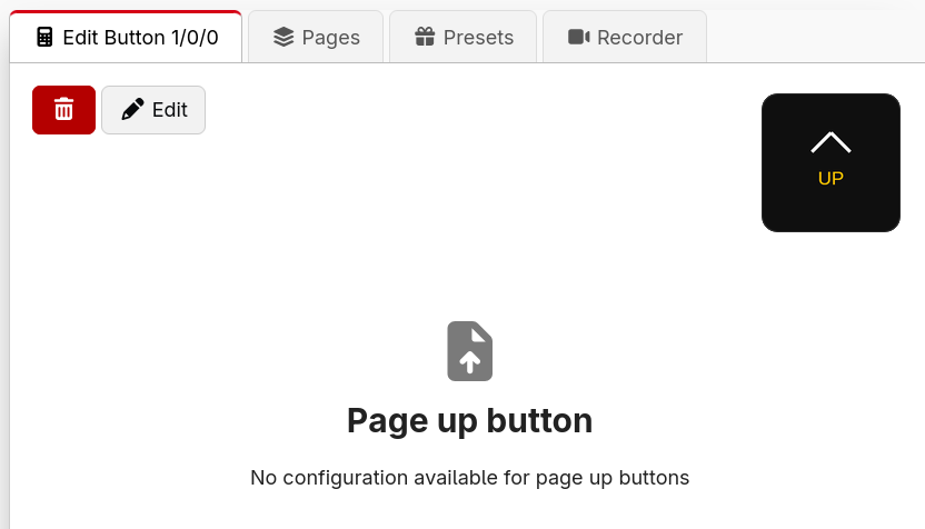
The Page up, Page number and Page down buttons are special buttons with built-in behaviour. If you'd like to change how one of them looks or behaves, click Edit (the pencil icon) to Convert to Normal Button. This turns the special button into a regular button with the equivalent actions already filled in, which you can then restyle and customise freely.
This is a one-way conversion and can't be undone.
Styling the button
A button's appearance is built from layered graphics elements — text, images, shapes and more. This is covered in its own section: Button styling.
A live preview of the button is shown in the top corner of the editor and updates in real time, so you can see your changes immediately on the Emulator and on any connected surfaces.
Behaviour options
As well as its appearance, a button has a couple of behaviour options:
- Step progression — how the button moves between steps when you've defined more than one. See Steps.
- Rotary actions — enable this to support the dials/encoders on a Stream Deck + (and other surfaces with rotation).
Adding actions
Add actions to the button from the Add Press/on action drop-down menu. You can add multiple actions and use the internal: Wait action to delay when certain things happen (delay times are in milliseconds, so 1000ms = 1 second). See Actions for the full details.
Notes
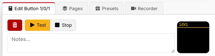
Every button has a Notes field (look for the Notes… box near the top of the button editor). Anything you type here is just for you — it's an internal reminder that never appears on the button itself. It's a great place to jot down why a button is set up the way it is, which is invaluable when you come back to a complex show months later. The same notes field is also available on triggers and expression variables.