Text element
A Text element shows some text on your button. That can be a fixed label, a variable, or the result of an expression. Most buttons have at least one Text element.
As well as the shared Drawing and Position & Size sections (see Button styling), a Text element has a Content section.
The text itself
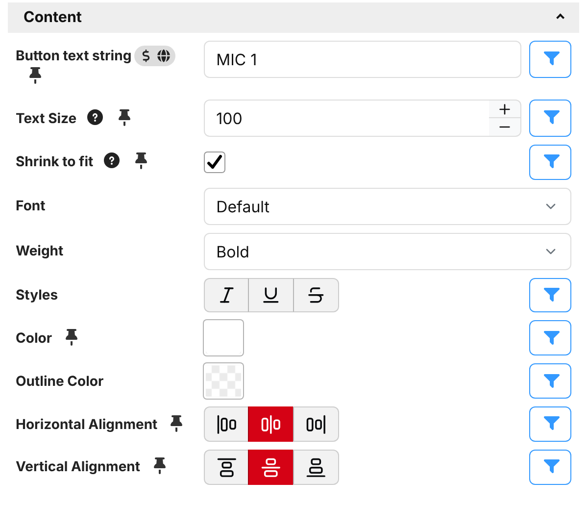
The Button text string field is where you type what to show. You can write it in one of two ways, switched with the toggle button next to the field:
- Variables mode — plain text, with variables inserted using the
$(connection:variable)syntax. For exampleNow on: $(internal:time_hms)orVolume $(myMixer:fader1)dB. - Expression mode — the whole field is treated as an expression,
which is great when you need logic or formatting. For example
$(myMixer:muted) ? 'MUTED' : 'LIVE'.
To force a line break, type \n where you want the text to wrap, for example Camera\n1.
Font
The Font dropdown chooses the typeface:
- Default — Companion's standard proportional font. Best for most labels.
- Monospace — a fixed-width font where every character is the same width. Handy for numbers, timers and tables that you want to stay neatly aligned as the value changes.
You can also style the text:
- Weight — Normal or Bold.
- Styles — toggle Italic, Underline and Strikethrough. Any combination can be used together.
If you switch this to an expression, it should return a list of the styles to use, such as
['italic', 'underline'], or[]for none. For example$(custom:standby) ? ['italic'] : []makes the text italic while a custom variable is true.
Sizing the text
In older versions of Companion a single font size setting tried to do two jobs at once. In 5.0 it's split into two clearer controls:
- Text Size — the size of the text, as a percentage of the element's height. Pick the size you'd ideally like the text to be.
- Shrink to fit — when ticked, Companion is allowed to shrink the text below your chosen size if it would otherwise be too long to fit. It uses the largest size at which the text fits, down to a tenth of the element's height. When unticked, the text always stays at your chosen size, even if that means it gets clipped.
A common pattern is to set a comfortable Text Size and turn on Shrink to fit for fields that hold variable-length text (like a track name or a timer), so short values look bold and long values still fit.
Because the size is a percentage of the element, not the whole button, you can make a small Text element in one corner and the text will scale to that element. Resize the element in Position & Size and the text follows.
Color and alignment
- Color — the color of the text.
- Outline Color — an optional outline drawn around each character. A contrasting outline (for example black text outline) keeps text readable when it sits on top of a busy image.
- Horizontal Alignment — left, centre or right.
- Vertical Alignment — top, centre or bottom.