Image element
An Image element shows a picture on your button — an icon, a logo, a camera thumbnail, anything you like. You can stack a Text element on top of an Image element to label it.
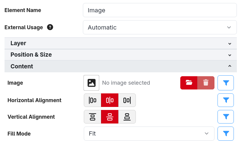
As well as the shared Drawing and Position & Size sections (see Button styling), an Image element has a Content section.
Choosing the image
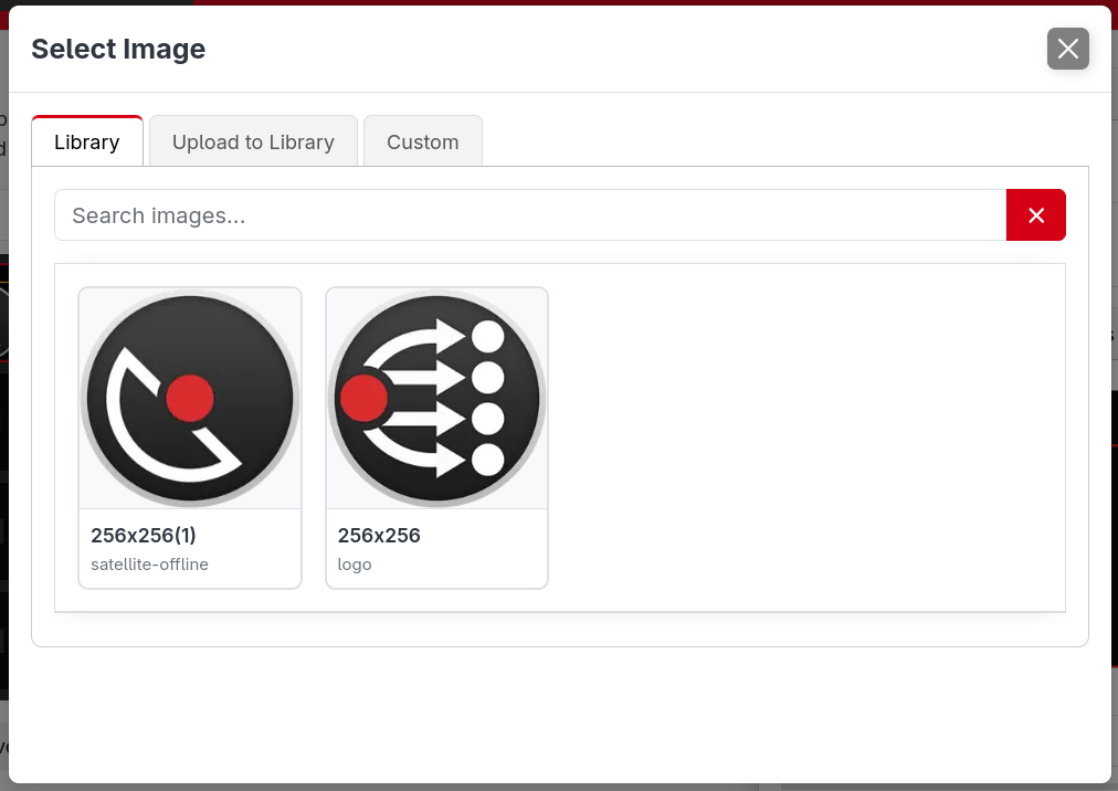
The Image field is a picker. There are two ways to give it an image:
- Upload one directly. Click Select image and choose a file from your computer. The image is stored inside that button, so this is limited to images up to 512KB. Put anything larger in the Image Library instead.
- Reference the Image Library. Pick an image you've already uploaded to the Image Library. This is the recommended approach when you want to reuse the same image on lots of buttons — update it once in the library and every button that references it updates too.
A library image is referenced by name using the $(image:name) syntax, so you can also type or paste
a reference into an expression if you prefer.
Animated images
Animated GIF, PNG (APNG) and WebP images play on the button, looping forever.
- Animations play at up to 10 frames per second, which is how often Companion redraws buttons. A faster animation still plays at its own speed, but skips the frames in between.
- Every copy of the same animation stays in sync, even across different buttons and surfaces.
- Animations longer than 30 seconds are cut short.
- A very large animation is scaled down to limit how much memory it uses.
Fitting and positioning
- Fill Mode controls how the image is scaled to the element's size:
- Fit — scale the image so the whole thing is visible inside the element (the default).
- Fill — scale the image so it covers the whole element, cropping any overflow.
- Crop — crop the image to the element's size without scaling.
- Horizontal Alignment / Vertical Alignment — where the image sits within the element when it doesn't fill it completely.