Groups & references
Two element types help you organise and reuse your designs: Group and Reference.
Group
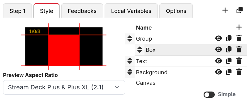
A Group is a container that holds other elements. Drag elements into a group (or add new ones while a group is selected) and they become its children, shown indented in the elements list.
Grouping is useful because:
- You can move, resize and rotate the whole group at once — the children move with it.
- You can show or hide a whole set of elements together using the group's Enabled field.
- It keeps complex buttons tidy.
An empty group shows an "Empty group" placeholder in the elements list until you add something to it.
Square Aspect Ratio
In the group's Options section there's a Square Aspect Ratio toggle. When enabled, the coordinate space for the group's child elements is constrained to a square (using the shorter side) and centred within the group.
This solves a common annoyance: shapes like arrows look stretched when a button isn't square. By putting an arrow inside a group with Square Aspect Ratio turned on, the arrow keeps its shape on tall or wide surfaces. This is exactly how Companion's built-in page navigation buttons keep their arrows looking right.
Reference
A Reference element mirrors the rendered graphics of another button. Whatever that button draws, this element draws too.
A Reference element only copies how the other button looks, and you can place it anywhere among the other elements of your button. If you want a whole button to act as another button, including pressing it, use a Button reference instead.
This is perfect for reusable designs. You can build one button exactly how you like it, then point Reference elements on other buttons at it — change the original and they all follow.
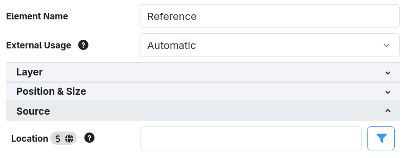
In the element's Source section, set the Location to the button you want to mirror, in
page/row/column format (for example 1/0/0 for page 1, row 0, column 0). The field accepts
expressions, so you can reference a button dynamically — for example
$(this:page)/0/0 to always mirror the top-left button of the current page.